|
|
|||
|
Graphic Art Painting Poster Sculptures + Reliefs Graphic Design Photography |
|||
|
Commercial
Artwork
and Visual Communication At the same time, he makes innovative designs for the office furniture manufacturer “Fortschritt”, e.g. letterpaper anticipating the employ of white spaces taken up in commercial art work after World War II. At the end of 1929, Stankowski starts to work for the advertising agency of Max Dalang in Zurich, where he becomes the actual stimulator and first practitioner of the factual Swiss commodity design. The serial and precisely calculated shapes developed by Stankowski in Zurich until 1934 for advertising and informational purposes also influence constructive and concrete art, which whose protagonists in Zurich, Richard Paul Lohse and Max Bill, Stankowski has manifold connections. He remains an uncompromising factual and modern designer after his return to Germany in 1934 employing, for example, photograms in the design of pod packages in 1938. In his postwar works, Stankowski
expands
functional design into visual communication. Numerous
word and picture
marks are developed in the greater context of corporate
identities. In
the middle of the fifties, the graphic artist Anton
Stankowski becomes
a studio director, his large order book requires an
increase of
manpower. However, it is not a boost in quantity which
Stankowski
intends, but in quality: consequently his “Viessmann”
word mark in 1965
starts the first corporate design project for capital
goods, which will
determine the whole field in an international context.
With an equally
great influence on worldwide graphic communication
follows the
development of the Berlin layout (presented in 1968) as
a complex
system of public graphic design. In 1972, Karl Duschek joins the studio as a staff member, at first. In him Stankowski finds the ideal partner for large tasks, such as the development of the corporate identity of the Deutsche Bank, which Duschek outlines according to Stankowski’s signet draft in 1974 and realizes in the studio. This mark has an exemplary effect for the financial service segment and has found numerous imitators worldwide. Jörg Stürzebecher
|
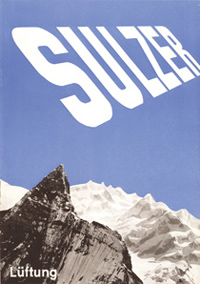
Sulzer, Prospektumschlag
|
||
|
|
|||
|
Logo Deutsche Bank |
|||
|
The publication of the works by
Anton
Stankowski is only allowed with permission of the
Stankowski-Foundation
© Stankowski-Stiftung.
|
|||


